The Latest Data Visualization Tools, Examples & Trends to Master for 2024

Get the most out of your data with these data visualization tools and examples
In the fast-paced world of technology and analytics, staying up to date with the latest trends and tools is crucial to master the art of data visualization.
The year 2024 promises to be an exciting time for those immersed in the world of data science and visualization, with new technologies and innovative examples emerging at a rapid pace.
To get the most out of your data and capitalize on the wealth of information held within, it pays to understand the cutting-edge data visualization tools and trends that are set to define data science in the coming years.
So whether you’re looking to get into the data science field or you’re a business owner looking for a competitive edge, here are some key tools, examples, and trends to master for 2024.
Everything you need to know about data visualization tools and trends:
Jump to…
- What is data visualization?
- Data visualization tools
- Data visualization examples
- Data visualization trends
- Data visualization jobs
What is data visualization?
Data visualization is the graphic representation of data, often employing various elements, including charts, graphs, and maps, to communicate complex data sets in a simple and intuitive manner.
Its evolution, largely driven by technological advancements and the exponential growth of data, has transformed the way businesses and individuals comprehend and utilize data.
Data visualization’s growing significance lies in its ability to reveal patterns, correlations, and trends that might go unnoticed in text-based data, thus facilitating data-driven decision-making and strategy formulation.
Data visualization tools
Data visualization tools include platforms like Tableau, SAS Visual Analytics, Google Data Studio, and OBIEE.
- Tableau: A flexible data visualization tool that empowers users to effortlessly craft interactive and easily distributable dashboards.
- Power BI: Microsoft’s business analytics tool takes data from diverse sources and converts it into dynamic reports and dashboards.
- Google Data Studio: Google offers a powerful tool that transforms complex data analytics into clear and concise reports, complete with customizable dashboards.
- QlikSense: Formerly known as QlikView, this BI tool excels in data visualization, dashboard development, and reporting, offering optimal functionality and user-friendly features.
- SAS Visual Analytics: A powerful visualization software that offers interactive reporting, advanced analytics, and self-service business intelligence capabilities.
- Oracle Business Intelligence Enterprise Edition (OBIEE): Oracle’s comprehensive BI tool that delivers a full range of capabilities including interactive dashboards, reporting, and analysis.
- Plotly: A graphing library that makes interactive and visually appealing graphs online.
- FusionCharts: Discover a versatile JavaScript charting library that provides an extensive range of charts and maps to perfectly match your data visualization requirements.
- Highcharts: A JavaScript charting library that delivers seamless and engaging charts for both web and mobile projects.
- D3.js: A JavaScript library that leverages data to dynamically manipulate documents, enabling the creation of stunning and intricate visualizations.
These are just a few of the popular data visualization tools being used today, each with its own unique features and capabilities. As technology continues to advance, we can expect to see even more innovative data visualization tools enter the market.
10 data visualization examples
Data visualization examples can include, Infographics, Network Diagrams, Scatter Plots, Heat Maps, and Sankey Diagrams.
- Infographics
- Interactive dashboards
- Heat maps
- Network diagrams
- Bubble charts
- Treemaps
- Geographic maps with overlays
- Scatter plots
- Gantt charts
- Sankey diagrams
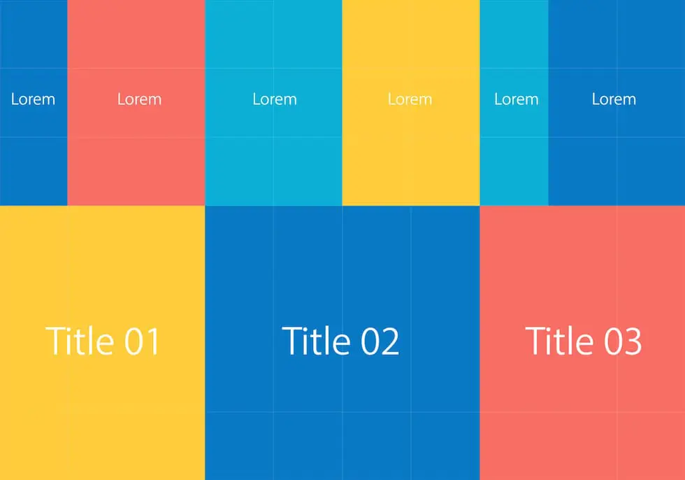
1. Infographics for data visualization
Infographics are visual representations of data that combine text, images, and graphics to convey complex information in a visually appealing and easily understandable manner.
With the rise of social media and content marketing, infographics have become an increasingly popular way to communicate data-driven insights.
2. Interactive dashboards for data visualization
Interactive dashboards allow users to interact with data by filtering, drilling down, or changing variables in real-time. They provide a quick and intuitive way to analyze large data sets, making it easy to identify patterns and trends.
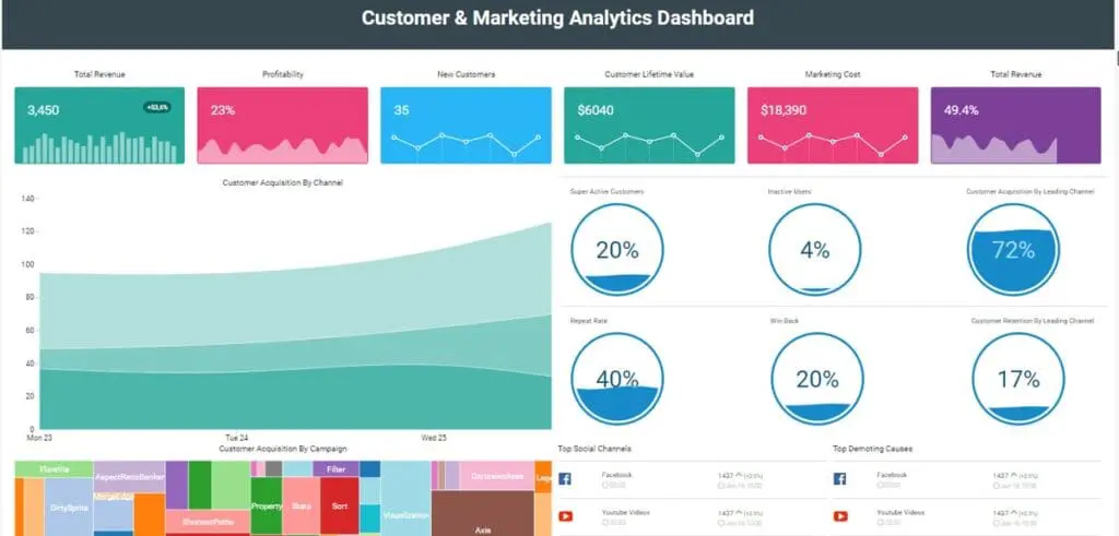
Image Source: Wikipedia
3. Heat maps for data visualization
Heat maps use colors or shading to display data points on a map, with warmer colors indicating higher values and cooler colors indicating lower values. This type of visualization is commonly used for geographic data such as population density, weather patterns, and consumer behavior.
Image Source: Wikipedia
4. Network diagrams for data visualization
Network diagrams visualize relationships between different entities, such as organizations or individuals. They are commonly used in social network analysis and can reveal important insights about connections and interactions within a network.

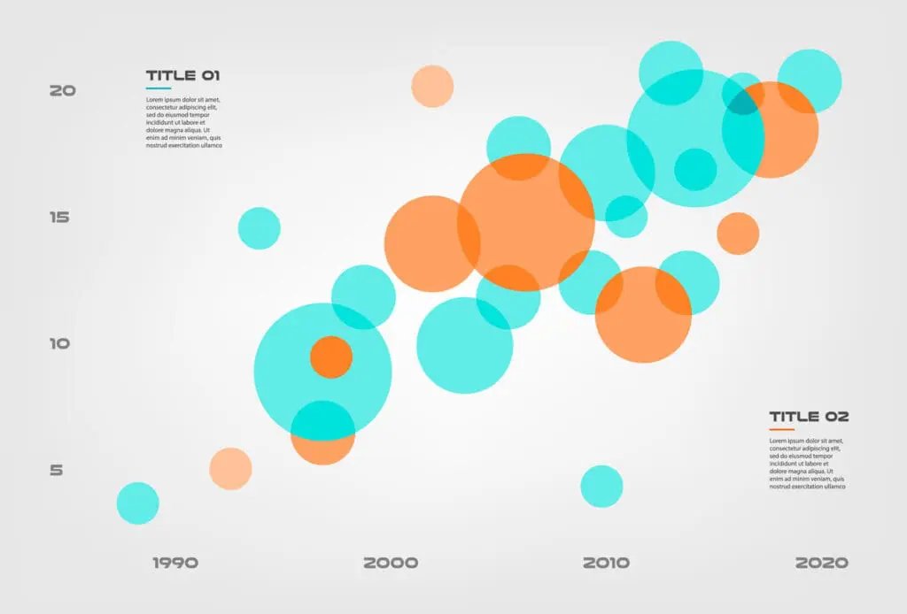
5. Bubble charts for data visualization
Bubble charts use circles of varying sizes to represent data points. The size of the bubble typically correlates with the value of the data point, making it easy to spot trends and outliers at a glance.
6. Treemaps for data visualization
Treemaps use rectangles of varying sizes and colors to represent hierarchical data structures. They are particularly useful for visualizing large categorial data sets and comparing values within different categories.
7. Geographic maps with overlays for data visualization
Geographic maps with overlays combine traditional geographic maps with additional layers of information such as population density, income levels, or election results. This type of visualization allows for a deeper understanding of data in a specific geographic context.

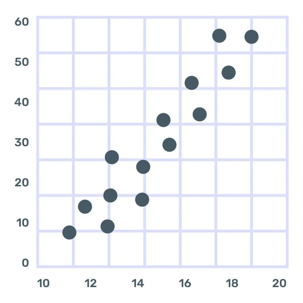
8. Scatter plots for data visualization
Scatter plots use dots to display the relationship between two variables. They are useful for identifying correlations and trends, as well as outliers in a data set.
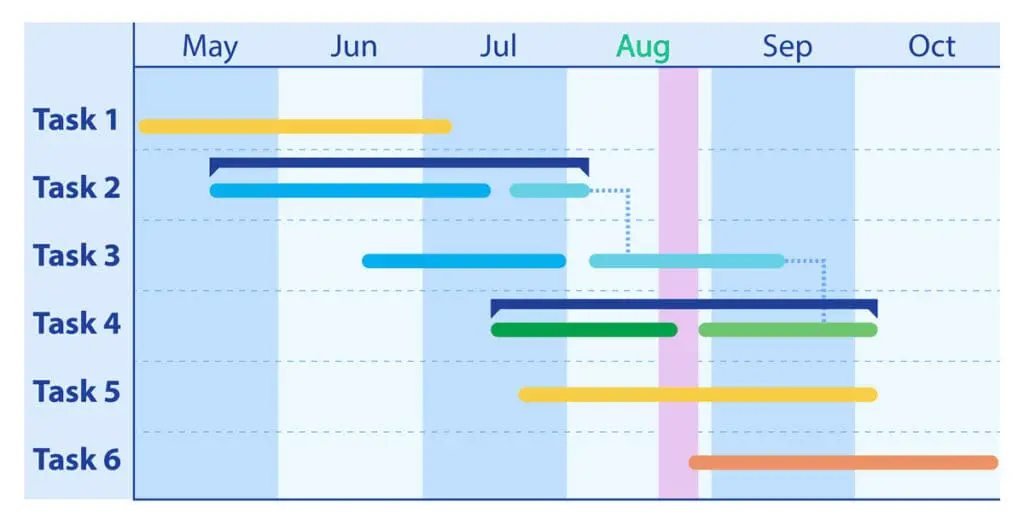
9. Gantt charts for data visualization
Gantt charts use bars to display project schedules and progress over time. They are commonly used in project management to track tasks, deadlines, and resource allocation.
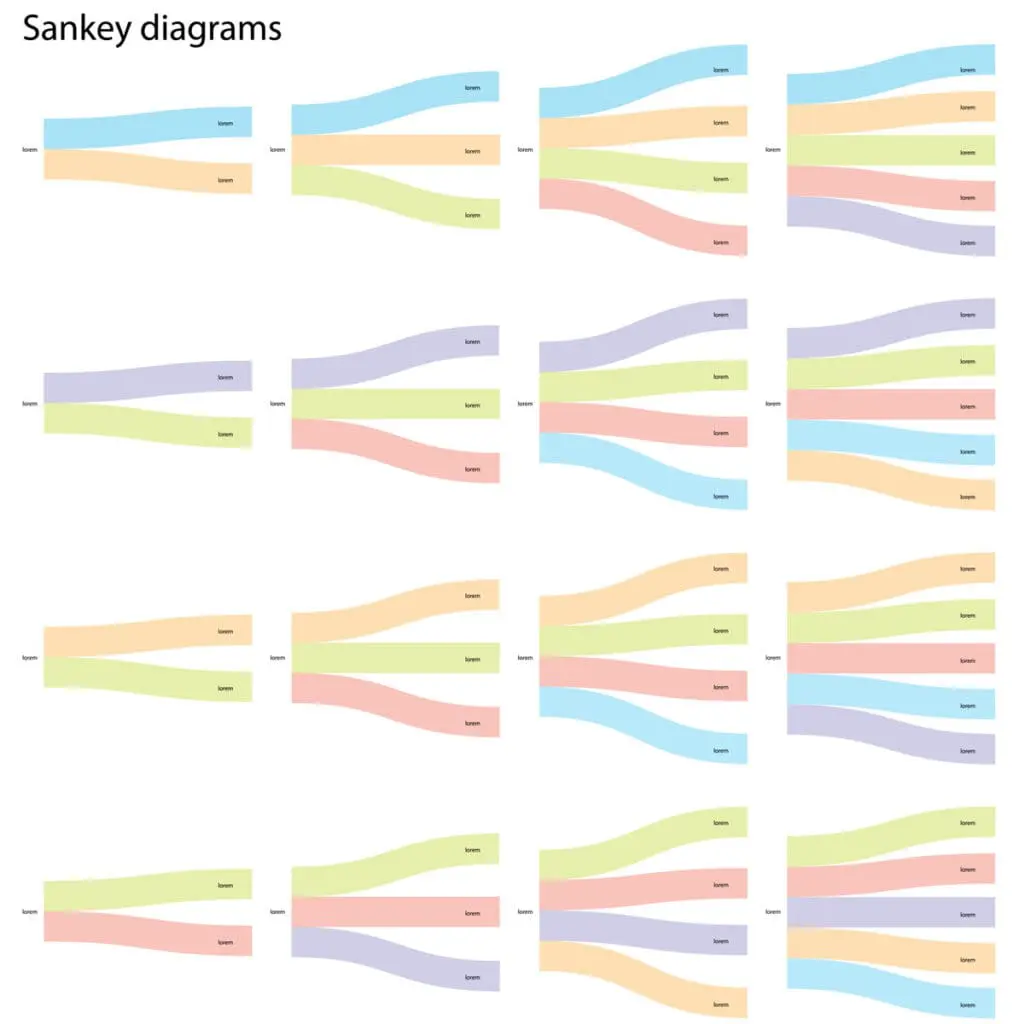
10. Sankey diagrams for data visualization
Sankey diagrams use arrows of varying thickness to show the flow of data or resources between different stages or categories. They are useful for visualizing complex processes, such as energy flows or transportation networks.
10 data visualization trends
Data visualization trends include AR and VR, AI and machine learning, the rise of dark mode designs, and human-centered design principles.
- AR and VR in data visualization
- AI and ML integration
- Real-time data visualization
- User interactivity and customization
- Storytelling through data visualization
- Rise of dark mode designs
- Collaborative cloud-based data visualization
- Mobile-first data visualization
- Human-centered design principles in data visualization
- Unconventional visual elements
1. AR and VR in data visualization
Augmented Reality (AR) and Virtual Reality (VR) technologies are revolutionizing the field of data visualization by providing a more immersive and engaging user experience.
This advanced technology allows users to not just view, but also interact with data in a three-dimensional space, facilitating a deeper understanding of complex data sets.
The increasing prevalence of AR and VR in data visualization marks a significant shift towards creating more intuitive and interactive platforms for data interpretation and analysis.
2. AI and ML integration
The integration of Artificial Intelligence (AI) and Machine Learning (ML) in data visualization is transforming the way we analyze and understand data.
These advanced technologies are capable of automatically detecting patterns, correlations, and trends in large data sets, providing users with actionable insights without the need for manual analysis.
As a result, AI and ML are paving the way for more intelligent analytics, enhancing decision-making processes and driving business growth.
3. Real-time data visualization
With the rise of IoT and increasing amounts of real-time data being generated, the demand for real-time data visualization has grown significantly.
This trend enables users to visualize and analyze data as it is being produced, allowing for faster decision-making and identifying emerging trends or issues in a timely manner.
4. User interactivity and customization
In today’s digital landscape, users expect a higher level of interaction and customization in data visualization tools.
They want the ability to manipulate and explore data on their own terms, rather than just passively viewing pre-made visualizations.
This trend has led to the development of more user-friendly and customizable data visualization platforms, allowing for a more personalized experience.
5. Storytelling through data visualization
Storytelling has always been a powerful tool for conveying information, and data visualization is no exception.
By combining data with compelling narratives and visuals, data storytellers can effectively communicate complex insights to a broader audience.
This trend highlights the importance of not just presenting data, but also crafting a cohesive story around it.
6. Rise of dark mode designs
Dark mode has become increasingly popular in recent years, with many people claiming it reduces eye strain and increases battery life.
This trend has also made its way into data visualization, with more tools offering a dark mode option for their users.
Besides the potential health benefits, dark mode can also enhance the aesthetics of a visualization by providing higher contrast and making colors pop.
7. Collaborative cloud-based data visualization
The shift towards remote work has highlighted the need for collaborative data visualization tools that can be accessed and worked on by multiple users simultaneously.
Cloud-based data visualization platforms offer real-time collaboration, making it easier for teams to work together, share insights and make decisions based on the same data set.
8. Mobile-first data visualization
With more people accessing information through their mobile devices, there is a growing demand for data visualization to be optimized for mobile screens.
This trend requires data visualizers to design and present their work with a smaller screen in mind, making it more accessible and easier to interact with on mobile devices.
9. Human-centered design principles in data visualization
Human-centered design principles prioritize the needs and expectations of users when creating data visualizations.
This trend involves considering factors such as user experience, accessibility, and inclusivity in the design process.
By putting the audience at the center of data visualization, designers can create more meaningful and impactful visualizations that effectively communicate insights.
10. Unconventional visual elements
The use of unconventional visual elements such as animations, 3D graphics, and virtual reality is gaining momentum in the field of data visualization.
These elements provide an immersive and visually appealing experience, thereby aiding in the comprehension of complex data narratives.
By incorporating these interactive elements, data visualization is evolving beyond static charts and graphs, fostering a more engaging and intuitive understanding of data.
Data visualization jobs
- Data Analyst: Data professionals who meticulously inspect, cleanse, and analyze data to extract valuable insights and facilitate informed decision-making.
- BI Developer: These are the experts who craft and create strategies and tools to empower businesses in making informed decisions based on data.
- UX Designer: Designers who prioritize enhancing user satisfaction through optimizing the usability, accessibility, and interaction offered in a digital product.
- Data Engineer: The professionals responsible for designing and managing the architecture, including databases, large-scale processing systems, pipelines, and data sets, that organizations use for both operational and exploratory analysis.
- Data Scientist: Experts proficient in harnessing extensive data sets, employing statistical, mathematical, and computational techniques, to extract valuable insights and formulate data-driven strategies.
- Information Architect: Digital environment specialists who are adept at organizing and designing the structure of digital spaces, ensuring that information is readily accessible and user-friendly.
- Visualization Specialist: These skilled professionals specialize in transforming intricate data into visually appealing formats, ensuring accessibility and comprehension for diverse audiences.
- Market Research Analyst: Professionals collect and analyze consumer and competitor data to identify market trends, evaluate marketing strategy effectiveness, and forecast demand.
- GIS Specialist: Professionals in the field of Geographic Information Systems, specializing in the acquisition, analysis, and management of geographic data and spatial phenomena.
- Statistician: Professionals skilled in collecting, analyzing, and interpreting data utilize statistical theories to address real-world challenges.
The future of data visualization
With the increasing demand for data-driven decision-making, data science and data analyst roles are expected to see a surge in demand, making data visualization a sought-after skill in various industries.
As we move forward, the role of data visualization will continue to grow in relevance and importance, driven by advances in technology and the ever-increasing volume of data.
These visualizations not only make data more understandable but also enable quicker and more efficient decision-making processes.
Given its transformative potential, mastering data visualization and having the right team in place will be a significant asset for professionals across a myriad of industries.
Looking to hire top-tier Tech, Digital Marketing, or Creative Talent? We can help.
Every year, Mondo helps to fill over 2,000 open positions nationwide.
More articles about hiring and industry trends:
- What to Do When You Have Urgent Hiring Needs
- The Agricultural Revolution and the Role of AI
- Burnout vs. Stress in the Workplace: How to Identify & Prevent
- How to Lead High-Performing Teams Without Overworking Them
- Ultimate Year-End Management Checklist for Leaders to Ring in The New Year
- Generative AI & Its Impact on the Job Market: It’s Not All Bad News
- Understanding GenAI and Maximizing Its Potential in Business
- The Future of Recruiting: Top 10 Challenges in Tech and Digital Hiring
- How To Conquer the Top 10 Most Common Recruitment Challenges
- The Rise of Working Moms & the Role of Remote Work
- How to Recruit Top Data Scientists in a Competitive Job Market
- Lessons From Unicorn Companies: Hiring Strategies for Rapid Growth